Our company Merus GmbH has been in existence for 25 years. Using our logo as an example, we want to show how we have changed and adapted to the markets and trends.
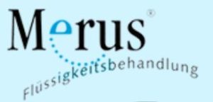
The first logo

We recognised the opportunities of the internet as early as 1998. So, we also needed an Internet site. The visual possibilities of today's internet presence were not yet conceivable, but a proper logo for recognition was necessary.
We commissioned a renowned advertising agency from the region. The logo should naturally pick up on the theme of water and oscillations. In the picture on the left you can see the result. Our company name, as well as a small bow reminiscent of oscillations and water drops.
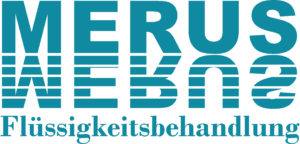
The second logo
Over the years, our appearance and our message to the market have changed. The picture on the left was the footer of the homepage in 2003.
The small pictures describe the applications in the household, and the message is still almost the same today. Calcified kettles, rusty pipes and overgrown pipes are still the most discussed topics in the end customer sector.

The white lettering on the dark blue background, also called negative printing, should shine even in the dark. And is ultimately due to the fact that all our packaging and brochures were also in this blue. The company name Merus is reflected in the water. Which in turn also picks up on our theme, we work with water and we reflect oscillations.
 A negative logo also has some disadvantages. It consumes huge amounts of ink or toner when printing. Because a relatively large frame always had to be printed with intensive colour so that the logo would have an effect. For a Swabian company, that's just not possible. So, we switched to positive printing and chose a somewhat lighter and friendlier colour.
The current logo

We didn't want to completely give up the connection to the industry and the water. We also didn't want to completely renew the logo. The result was a pastel blue called "Atlantis Blue", in keeping with the trend of today. This blue, complemented by a cheerful orange and a serious grey, became the basic colours of our website, which was relaunched in 2016.
The jubilee years
Merus celebrates its 25th anniversary this year 2021 and consequently its 20th anniversary in 2016. For these occasions we wanted to design something special, unique and stand out.
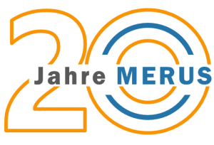
The logos for our 20th and 25th anniversaries were made in-house. Our creative minds designed two logos that matched the respective anniversaries.
 In 2016, the colours of our website were changed and adapted. In the course of this, our packaging, brochures and instructions were also adapted.
We wanted to underline this anniversary with a special anniversary logo. It did not replace our previous logo, but should complement it. Here, too, we picked up the new colours of our appearance: orange, grey and blue. It was also important that we kept the reference to our product, the Merus Ring. This is given by the ring-shaped 0 with a blue inlay as in our rings.
 So now it has been 25 years. There is not much reason to celebrate. Corona and various climate events, such as heat, fires, storms and floods, have shown that we have to take even more care of our environment. But that didn't stop us from designing an appropriate anniversary logo for the 25th anniversary.
At first there were some difficulties how to get a silver logo clear and sharp on a white background. But our designers mastered this task and created a wonderful and elegant logo. They also made sure to keep the reference to the Merus ring and to use our Merus colour palette.
Even though there have been many changes, we have tried to remain true to our values. We want to show this consistency with our logos and designs. In the next few years, changes will continue to await us, and we will do our best to master them as well.
